Hira Jamshed Portfolio
Due to the ubiquity of multiple digital devices and the pervasiveness of the hustle culture, staying focused on high priority tasks and ensuring consistent productivity in one’s lifestyle has become extremely important.
This is a semester long project, part of a course called 'Information Architecture and Design', under the industry expert Fleming Seay (Director of User Experience Research & Design at Dell)
According to research, students lack in effective time management, maintain attention for significant periods, struggle to understand and reflect on their patterns, and want to develop productive habits. To solve for this need:
Fall 2021 (10 weeks - February to April 2021)
Leadership | Strategy | Recruitment | Desk Research | User Interviews | Visual Design | Wireframing | Prototyping | User Testing | Data Analysis (Qualitative and Quantitative)
Product Designer & Information Architect
Lead Mixed-Methods UX Researcher
4 (other) UX Researchers/Designers: Dhrumik Sharma, Linea Marks, Apoorva, Sanjana
Considering the psychological nature of our problem, we greatly benefitted from following the design thinking process in an agile manner as shown below. The back-and-forth helped us to quickly iterate through solutions and keep sight of Lucidu's mission and vision.
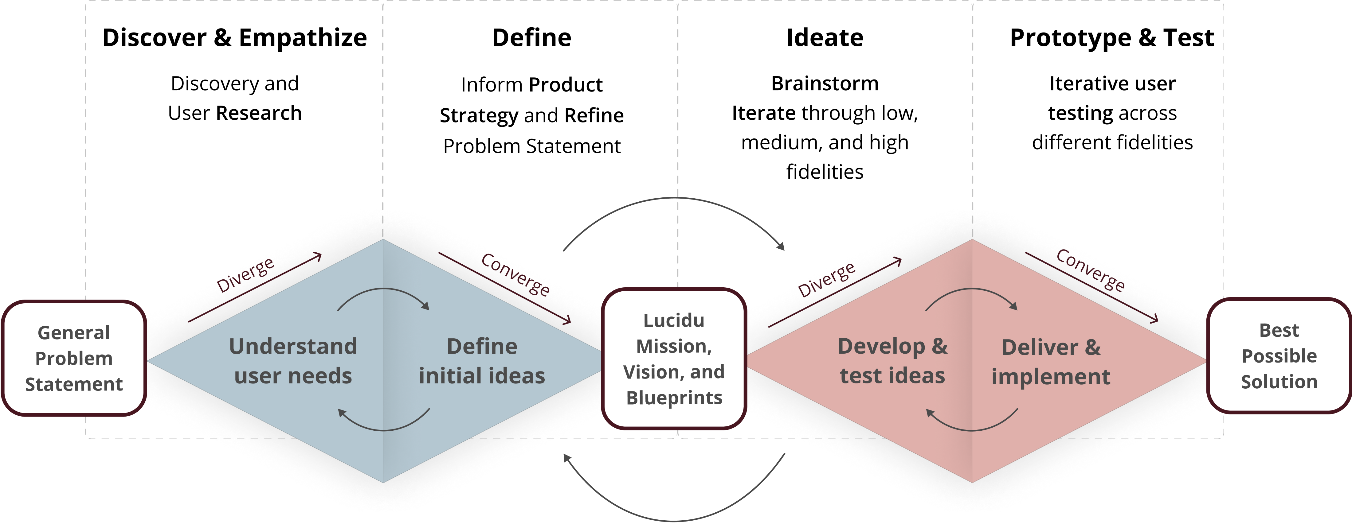
At the end, we were able to concretely flesh out the main functionalities of our product in accordance with the mission & vision:
Before planning and designing, I believe that it is important to ask important questions and understand context.
To answer this question, I decided to utilise cognitive literature (also my superpower the fundamental heuristics and cognitive processes involved in work, productivity, sustained focus, and task-switching.
I was better able to empathise with the underlying potential pain points in the users’ attitudes, behaviors, and usage of productivity apps. The following insights were instrumental to our design:
A behaviour is changed when one learns to overcome the barriers associated by focusing on the ‘why’ and ‘how’ involved in the change. Notions such as ‘nudges’, ‘self-regulation’, and ‘overcoming barriers’ play significant roles.
Motivation is a combination of the person, their context, and the task they are performing. Whether the behavior/task is enjoyable to achieve or not is defined by their intrinsic motivation (such as interest) and their need for an extrinsic motivation (such as nudges).
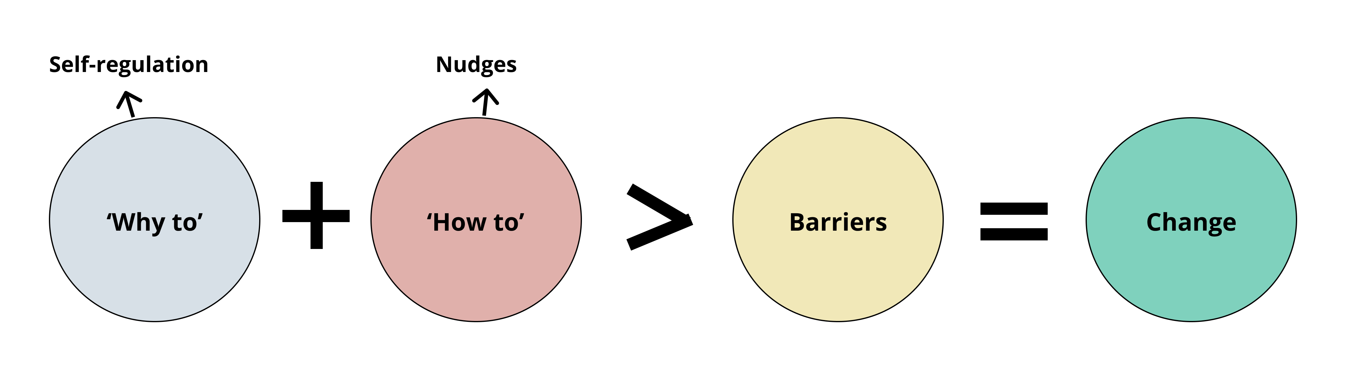
Behaviour Change Equation
And sustained efficiency can't be reached in one day. One viable solution is to practive single-tasking which helps you decrease the number of switches you do each day and begin to rebuild your focus and attention.
A general word in terms of implementation was to promote convenience by short times spent on setting things up and a combination of interactive features (self-monitoring) and passive features (diary, reminders).
To answer these questions, 22 mobile and desktop applications were analysed.
Competitors' Products
The goal here was to identify common features, differentiators, and pain points. To shape the way we thought about Lucidu's features, I split the data between three categories:
After aligning ourselves with what is currently out there and the fundamentals of effective productivity aids, the goal was to gain an in-depth understanding of user needs, work process, and approach to productivity.
I conducted 3 out of 7 interviews after screening participants on the basis of age, gender (equal balance), and use of digital tools. The following insights were critical to understanding:
Students are often frustrated by underestimating or overestimating the time required for a task as they pre-plan a day or week. This can also be due to the nature of work, such as research or job hunt, wherein the duration cannot be estimated. Students also struggle with focus and controlling time spent on distractions.
The ability to keep a record of accomplishments, behavioral changes, progress over time (zoomed-out), and microscopic progress through the day(zoomed-in) was established to be the primary objective behind various methods used by the users to stay productive.
Being able to view the self behavior over time in multiple aspects to analyze and reflect back on changes helps users to stay motivated and confident.
The approach to work and the work itself is very specific to individual capabilities, mindset, and characteristics. What works for breaks, what techniques improve focus, what scheduling is efficient depends on all these factors. Thus users prefer to devise their own solutions to stay productive by trial and error.
The goal was to gather quantative data on a large-scale regarding the work practices, frustrations, and preferred systems. The survey was made on qualitrics and distributed within our network through direct messages, discord channels, and word of mouth.
The questions revolved around the usage of the types of productivity tools, their frequency of use, and the desire to use them. We also recorded their feelings and work load to understand if there are any patterns to the reported systems of use.
However, not many insights could be gleaned from this method. The type of work a student has varies based on their field, degree, and where they are in their study.
After building an in-depth understanding of students in higher education, we set out to define the values and usage of our product.
As a first step towards solving the problem of maintaining productivity levels and developing constructive habits, we nailed down the mission and vision of the product. This served as our north star for all of the design activities that came next.
Lucido provides the most tailored and efficient support for workflow productivity available – a product that not only tracks your work habits, reports on your progress, and offers a wide range of customizable focus aids, but also learns how you work and adjusts to fit your unique process while ensuring it meets the level of expected productivity.
We understand that everyone has a unique workstyle. This has never been more apparent than it is now, in the age of hustle culture, where it is commonplace for people to spend all day every day at desks, computers, or classrooms. Consequently, a more purposeful approach to work and study is vital. Therefore, we are dedicated to help users grow to a work ethic they dream of. We strive to provide students with the tools necessary to achieve their goals without compromising health and wellbeing.
Borrowing from the general traits and attitudes covered through the interviews, I created the persona to relfect our larger user base: a student in need of a solution for managing their productivity, with a vested interest in working to more effectively manage their workflow, and open to trying digital solutions.
Next, I created some user scenarios. By describing a person’s current method for achieving a given goal, we were able to particularly point out where the need of our product stems from and how exactly it might solve the challenges. This helped us imagine ways our product could be better adapted to the intended audience, such as ensuring easy-to-digest graphs and compassionate tones.
The next phase includes my cyclical process of ideating, wireframing, prototyping, and testing.
As part of the product strategy, I helped create Lucidu’s system blueprint to record and group the functionalities of our application.
Based on the findings from the empathy phase, I included features and analytics that would help students see their working habits over a period of time and facilitate self-reflection.
Part of the system blueprint
Using the blueprint created during a team brainstorming session, I ideated on the dashboards 'overview' section by experimenting with different layouts of the page and the types of graphs to be shown. To help me stay focused, I constantly asked myself the following question: How might I display workflows to help derive useful and actionable insights about students' work time?
Utilising the inverted pyramid structure, I came up with the following sketches:
Sketches of the dashboard's overview screen
It was challenging to find a position in the trade-off between 'utility’ and ‘information overload' for the content shown. This could only be resolved through user input and research into different data visualisations (kudos to datavizcatalogue).
The resulting wireframe was born out of ensuring:
Lo-fi of dashboard's overview screen
However, there was a more pressing concern. When combined with the work of the other designers, this solution brought forward critical questions regarding navigation and layout.
The above question sparked a lengthy discussion with each member coming forwarded with different ideas and features. To help consolidate the information, I figured we needed much more than a broad blueprint. We needed a mind map!
The mind map helped contextualise where the different screens were and how all of the different ideas were catered to:
Dashboards' section of the mind map
To answer the questions, I decided to conduct an unmoderated open card sort through snowball sampling with 8 users. The method complimented our goal of understanding how students think. I made sure to use descriptive words for context and include short descriptions where needed. This was because our application presented some unique ideas and terminologies that would make sense after users have the understanding of the concept.
I helped refine the basic layout using data from the similarity matrix and dendrogram that came out of the study
Before and After of Dashboard's Information Architecture
Before moving to advanced versions of Lucidu, we decided to test our concepts with the students of higher education.
The research question I had for this screen was whether students understood and recognized the utility of the ‘overview’ screen. To elaborate:
To answer the above questions, I carried out 2 out of 4 usability tests by setting a figma prototype with 1 out of 3 tasks focusing on the dashboard overview screen.
Students complained about information overload and lack of clarity on first glance, specifically the second graph.
I decided to change the layout and include easy-to-digest graphs.
Before moving forward to incorporating the above feedback to higher fidelities, I sat down with the team to finalise a design system that communicates our brand. The goal for the brand image was to create an aura of seeking wisdom and truth, while being compassionate and supportive. Thus, our dominant colors were blue (calm and responsible) and green (growth).
A small portion of style guide
As we moved to higher fidelities, the team sat down together to collect all the reusable design components and assets. This design system helped our team to achieve higher efficiency, consistency and scalability while designing the final prototype. It included all the common components which would be used for multiple screens starting from screen size (with grids set), colours and fonts as assets, icons, all the forms of buttons including primary, secondary and text buttons, tooltips, etc.
A small part of the design system
I moved forward to complete 2 more rounds of user testing on usertesting.com to evaluate the medium and high fidelity designs of the 'dashboard overview' screen. I took over the responsibility of readying the test packets, ensuring complete user flow has been prototyped, and converting the painpoints into actionable tasks.
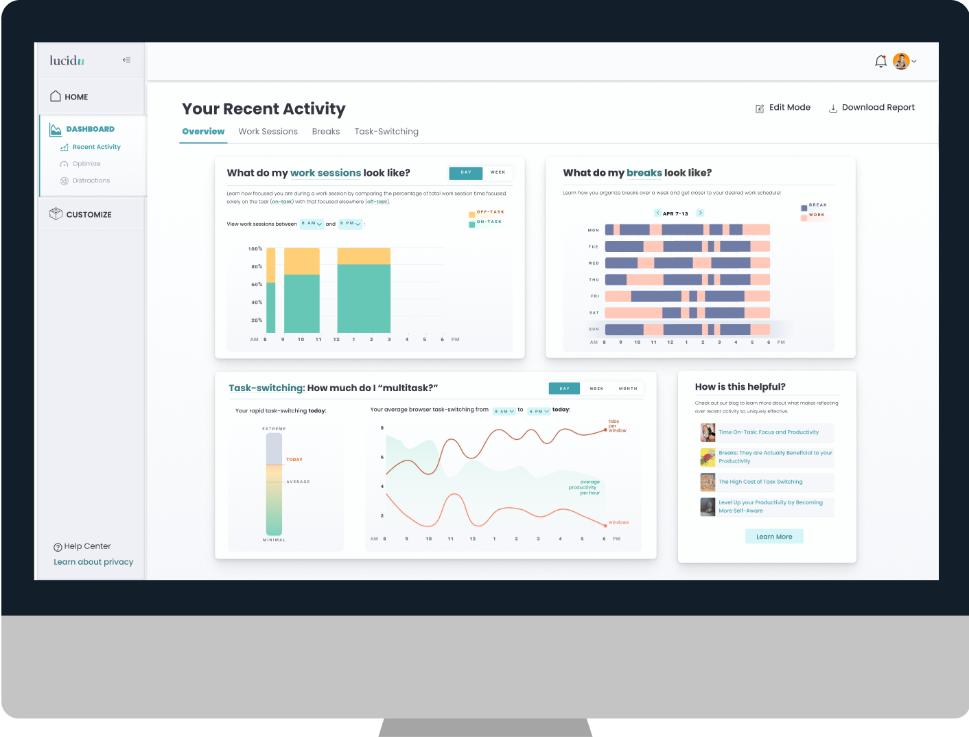
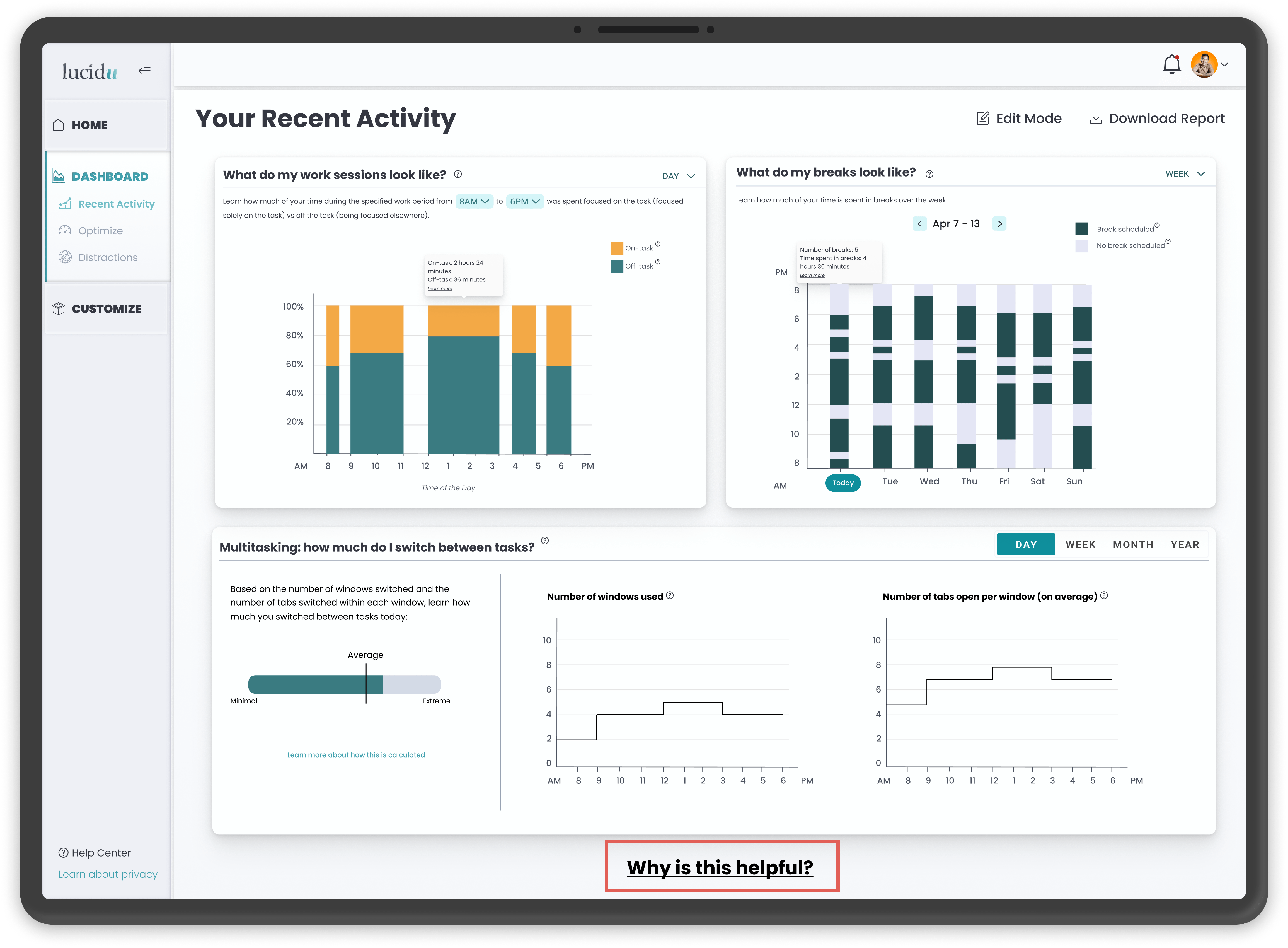
Users found difficulty in understanding the 'breaks' and 'multi-tasking' graphs. They wanted clarity in what the graph represents, and an immediate understanding of the metric being represented. To help solve this, tool tips were included and graphs where changed.
Old Screen
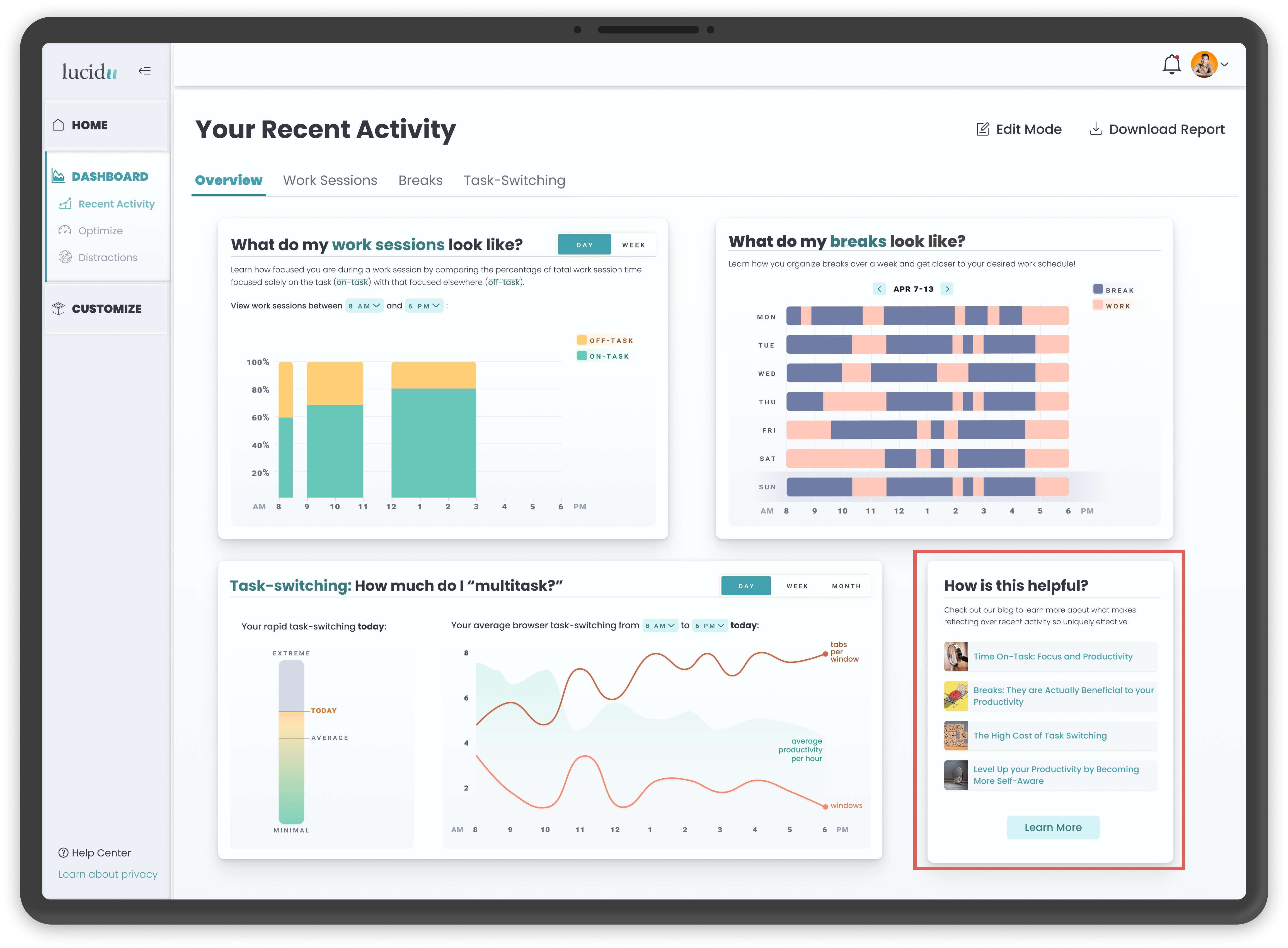
Final Prototype with Improved Visualisations
An integral functionality of Lucidu is to encourage self-reflection. Users often noticed the 'why is this helpful?' nudge too late, causing curiosity and confusion over the utility of some of the factors. To better facilitate understanding and encouraging self-reflection, we decided to provide little breadcrumbs in the form of article headings and make them prominent.
Old Screen
Final Prototype
While there were many things I wished to work more on or include in the final prototype, the following presents the most important ones: